State of Vermont (SOV) Web Template Regions
The State of Vermont (SOV) web template and design system is built in Drupal and managed by the Agency of Digital Services (ADS). The template includes 21 regions where you can place different types of content, like text, or images to create an engaging and accessible website. It’s designed to be flexible and user-friendly while meeting State standards.
Page Regions
Descriptions of all 21 regions of the SOV Web Template are provided below to help you decide where to place your content. This structure ensures your site stays organized, easy to use, and visually consistent. Visit the Regions Example page to preview how content appears in each region.
View Screenshot of the Web Page Region Map
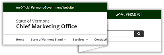
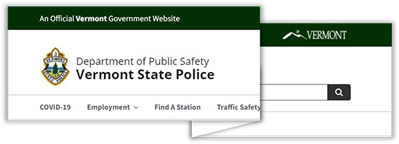
Header Region
The Header Region, also called the "Site Owner Identification Area," shows the name of the State entity. The name is set when the site is created and cannot be changed by users.
This region includes:
- The name of agency (or State of Vermont if independent) and site owner (department or division) on a separate line in larger and heavier font weight.
- An optional Legacy Logo (not Moon Over Mountains). Some entities have an approved legacy logo (e.g., Vermont State Police and Department of Forests, Parks and Recreation) that may be displayed in the Site Owner Identification Area. Partner or sponsor logos should not be displayed in the Site Owner Identification Area and should only appear in the body section.
- A search box.
How to Edit the Header Region
If you would like to make changes to the Site Owner Identification Area, the first step is to submit a service ticket to Tyler Technologies and the State of Vermont Director of Web Services.
Primary Menu Region
The Primary Menu Region is for your website’s main navigation and is often displayed as a top bar menu. You can use a Basic Header Menu or a Basic Header Menu with Megamenu here. Visit the Menus page to learn more.
Hero Region
The Hero Region is where you can add a Static Hero Image or a Hero Slider to highlight important content on your Homepage, Articles, or Basic Pages. This space is ideal for grabbing attention and setting the tone of your site. Visit the Hero Slide Page to learn more.
Highlighted Region
The Highlighted Region is typically used to display Alerts and help users quickly see essential messages. You can add different alerts here, such as green for success, blue for information, red for critical site issues, or yellow for warnings. Visit the Alerts Page to learn more.
Breadcrumb Region
The Breadcrumb Region is the location for the Breadcrumb Navigation. As users navigate to different levels of a menu, Breadcrumb Navigation provides a direct link back to primary landing pages. Visit the Breadcrumb Navigation page to learn more.
First Sidebar Region
The First Sidebar Region appears on a site's left side/column. A Sidebar Menu or Widgets (Image and Text - Sidebar Regions) are commonly placed in this region.
Content Top Region
The Content Top Region resides below the Breadcrumb Region and to the right of the First Sidebar. It appears above News, Basic Page, and Document content. Basic Blocks, Images, and Data Visualizations are frequently placed in this region.
Two Column Content Top Region
The Two-Column Content Top region is a two-column formation. Widgets (Image and Text - 2 Column) are frequently placed in this region.
Three Column Content Top Region
The Three-Column Content Top region is a three-column formation. Widgets (Image and Text - 3 Column) are frequently placed in this region.
Second Two Column Content Top Region
The Two-Column Content Top region is a two-column formation. Widgets (Image and Text - 2 Column) are frequently placed in this region.
Content Region
The Content region is a one-column formation. Basic Blocks, Images, and Data Visualizations are frequently placed in this region.
Two Column Content Bottom Region
The Two-Column Content Bottom region is a two-column formation. Widgets (Image and Text - 2 Column) are frequently placed in this region.
Three Column Content Bottom Region
This Three-Column Content Bottom region is a three-column formation. Widgets (Image and Text - 3 Column) are frequently placed in this region.
Second Two Column Content Bottom Region
The Second Two-Column Content Bottom is a two-column formation. Widgets (Image and Text - 2 Column) are frequently placed in this region.
Content Bottom Region
The Content Bottom region is a one-column formation. Basic Blocks, Images, and Data Visualizations are frequently placed in this region.
Second Sidebar Region
The Second Sidebar Region appears on a site's right side or column. A Sidebar Menu or Widgets (Image and Text - Sidebar Regions) are commonly placed in this region.
Primary Footer Region
The Primary Footer Region is where Contact details for your site are placed. The Footer section is hard-coded to include the title Contact Information, and editors can add the required details in this spot. It’s a statewide mandate to include contact information in the designated format to ensure consistency across all Vermont government websites.
Second Footer Region
The Second Footer Region appears to the left of the Primary Footer Region. Basic Blocks or Widgets (Image and Text - 3 Column) are frequently placed in this region.
Third Footer Region
The Third Footer Region appears to the left of the Second Footer Region. Basic Blocks or Widgets (Image and Text - 3 Column) are frequently placed in this region.
Fourth Footer Region
The Fourth Footer Region appears to the left of the Third Footer Region. Basic Blocks or Widgets (Image and Text - 3 Column) are frequently placed in this region.