The Moon Over Mountains logo is the primary graphic element used to identify the State of Vermont. The logo always consists of two elements, the “Moon Over Mountain” symbol and the Vermont logotype and there are two acceptable arrangements. This logo should appear on all internal and external print and digital communications.

The logo makes use of two colors: Vermont Green (Pantone 356) and black. The only other acceptable color variations are all black or all white (reverse).
Find general information and guidance related to:
- Available arrangements
- Use with identifiers
- Branding for social media
- Branding for multi-agency collaboration
- Usage guidance
- Providing the State of Vermont Logo to External Entities
Registered Trademark
The Vermont logo is a registered trademark protected by law. State of Vermont offices may use it in accordance with specifications defined herein for marketing and promotion of state government goods, services, and agency or department authorized sponsorships. The logo may not be altered or modified by state officials or adapted for use by private entities.
Obtaining Logo Files
The Chief Marketing Office is the sole authority for maintaining and creating the Official Vermont logo files. It is against guidelines to modify, create, or recreate the Coat of Arms or Moon Over Mountains logo files.
For questions concerning use or to obtain the Moon Over Mountains logo with or without an identifier for your marketing piece, please contact us at marketing@vermont.gov. We can provide high-resolution image files in multiple file formats to State entities upon request, and to private organizations when the State of Vermont is a partner or sponsor.
Available Arrangements
Horizontal Arrangement
The horizontal arrangement is the preferred version and should be used whenever possible.

Vertical Arrangement (Social Media or Approved Use Only)
The vertical arrangements is available for use for social media profile pictures or at the discretion of the Chief Marketing Office when necessitated by space or design considerations.

Use With Identifiers
The horizontal arrangement of the Moon Over Mountains logo is available with agency, department, and division identifiers. When using the logo with identifiers, a thin rule is used to separate the two elements.
No more than two lines of identifiers can be used and the text may not extend beyond the left edge of the rule and logo. The order of identifiers is hierarchical, with the Department or Agency first and any additional identifiers below.
More About Identifiers
- Email addresses should not be used as an identifier.
- A State entity is defined as an agency, department, division or program.
- The capitalization of website URLs is left to the discretion of individual State agencies.
Acceptable Logo With Identifier Combinations


Branding for Social Media
Social media profile pictures are an example of when space considerations call for the vertical arrangement of the logo to be used. To ensure branding consistency across platforms, the vertical arrangement is available with an agency, department or division identifier. No more than one identifier, spanning a maximum of two lines, can be used.

Branding for Multi-agency Collaboration
When two or more state agencies collaborate with one another, the multi-agency format of the Moon Over Mountains logo is to be used. This format is available with either the horizontal or vertical arrangement.


Usage Guidance
Placement
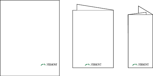
While the placement of the Moon Over Mountains logo on any particular document is flexible, in general it is placed in the lower right corner. In this position, the logo acts as a formal sign-off or endorsement of the preceding message. In the case of a folded brochure or multipage document, the logo should be placed on the center of the back panel to achieve a similar effect. This helps to create a visual consistency regardless of document type or format.

Incorrect Usage
Examples of unacceptable usage of the Moon Over Mountains logo:
- Never substitute or alter colors.
- Never use alternate fonts.
- Never rearrange the logo elements.
- Never separate the logo elements.
- Never distort the shape of the logo or any individual element.
- Never tilt the logo.
- Never outline the logo.
- Never create a 'read-through' header with the logo.
- Never use outdated logos.
