The Web Look and Feel Standards help users recognize when they are on an official State of Vermont site. These Standards are part of the SOV Web Template, which is free for State entities to use. The SOV Web Template consists of a fully-supported Content Management System through the Agency of Digital Services, as well as a secure hosting environment and software upgrades. State entities are required to use the SOV Web Template when building and managing a website.
In some cases, the SOV Web Template may not be an adequate solution for the digital needs of a particular agency, department or program. If you need to build a custom site outside the SOV web template, talk with your ADS representative to request permission. If you receive permission to develop a custom site, be sure to incorporate the Web Look and Feel Standards into the custom site to ensure it aligns with State branding.
The Web Look and Feel Standards consist of the required components that every official State of Vermont website or app must have. Learn about these required components, including:
Find general guidelines and best practices for accessibility, including:
- Typography
- Alternative text
- Links
- Color Contrast
- Tables
- Headings
- Captions
- Webpages, not PDFs
- Plain Language
- Responsive Design
Are you working with a contractor on website or web application development?
Before you initiate work on a website project with an outside vendor, include a link to the Web Look and Feel Standards in the Statement of Work. Adherence to these requirements should be part of the performance measures for these contractors.
SOV Web Template Required Components
Header

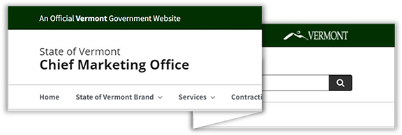
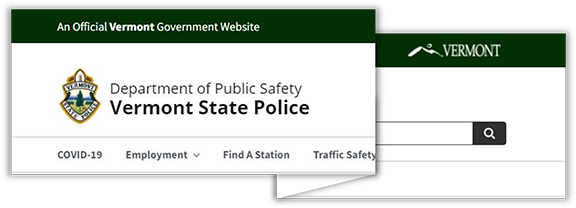
The top of every page will be taken up by the site header. The required elements include:
Branding Bar in Dark Green
- Background color of
#003300 - Words “An Official Vermont Government Website” in sans serif, white text. Word ‘Vermont’ in heavier font weight.
- Horizontal arrangement of the Moon Over Mountains logo in white with a transparent background. The logo will be a live link to the state web portal at
https://www.vermont.gov/.
Site Owner Identification Area
- Visually displayed below branding bar
- Name of agency (or State of Vermont if independent) and site owner (department or division) on a separate line in larger and heavier font weight.
- Optional agency/department/program logo (not Moon Over Mountains, but another CMO-approved logo such as the Vermont State Police logo) may only to be displayed on in the header. These may not be displayed anywhere else on the site except in the body section where appropriate. Partner or sponsor logos should be displayed only in the body section.

Search Box
The exact styling of a search box is not dictated by this standard, but prominent secondary navigation must be included directly beneath the dark green branding bar (on the right side of the display area, underneath the Moon over the Mountains logo and within the Site Owner Identification Area), in the form of a button, box or another visual element that allows a user to type in a search term to find content within the site.
About and Contact Information
The exact styling or placement of the About (or similar terminology) and Contact Information is not dictated by this standard, but a prominent link is required to each item on the home page. Such content will specify the relationship of the site owner to the State of Vermont.
Footer

The footer will appear at the bottom of the display area on all pages contained in a particular site. The required elements of the footer include the following.
Branding Bar in Dark Green
- Background color of
#033003 - Words ‘Copyright © [current year] State of Vermont. All rights reserved.’ in white, centered-, sans-serif text.
- Consider adding live links for an Accessibility Policy and Privacy Policy that are specific to your agency, department, or project.
Request an Exception or Modification
If your website or application requires exception or modification to any of the standards outlined herein, contact the Chief Marketing Office at marketing@vermont.gov. We review requests and advise on solutions that are in accordance with the State of Vermont Brand Standards and Guidelines.
General Guidelines and Best Practices for Accessible Sites
Typography
Sans-serif fonts are recommended for all body text. The preferred typefaces for web applications, in accordance with the overarching State of Vermont Brand Standards and Guidelines, are Open Sans and Lato. Header text must be noticeably larger than body text. At a minimum, every state website will use a font size set to 1em and a weight of ‘normal’ for body text.
Alternative Text
Alt text can be read by screen readers and helps people who are blind or who have low vision understand the visual content. All images, charts and graphic elements must include detailed information in the alt attribute so that users relying on screen readers can understand the message conveyed by an image or graphic.
Links
Active links used to navigate to additional content must behave consistently and links need to be descriptive, telling the user where the link will take them.
- Inline links (links within the body copy) must incorporate two visual cues to distinguish the link from the rest of the body text. The preferred style is to apply an underline and a contrasting color that is has been tested for readability.
- Links to external sites (web pages not part of the current site) and documents (PDFs, Word documents, etc.) should open in a new browser window.
- Link titles should be descriptive of the action that will happen when the user activates the link, e.g., ‘Download grant application’ or ‘Read more about the grant program.’ Avoid using terms such as ‘Click here’ or ‘PDF’ for link titles, because users with screen readers or other assistive technology will not be able to tell where the link will go if clicked.
Color Contrast
Make sure text and data can be understood without color. Choose color combinations with high contrast. When in doubt, refer to our Color Palette page and the WebAIM contrast checker.
Tables
Use tables sparingly to display data and avoid using tables as layout tools. Users relying on screen readers can have a hard time navigating tables if they are not set up properly (with styles, headers and alt text).
Headings
Use heading styles to organize the information. Users relying on screen readers rely on properly placed headings to navigate the content. By using headings in the correct order(<h1>, <h2>, <h3>…), the content of your webpages will be easy to follow for screen reader users. Avoid skipping heading levels (ie going from <h2> to <h4>) because that confuses screen readers. Finally, avoid selecting a header simply because it looks nice visually. Headings should be used to indicate and organize webpage structure.
Captions
If videos are on the website, be sure to provide captions in the videos so that users who are deaf or hard of hearing can understand the content without having to rely on the visuals alone.
Webpages, not PDFs
Assuming you selected an accessible CMS, create webpages to display content, rather than linking from your webpage to inaccessible PDFs or Word documents. If you must link to a PDF or Word document, make sure you are linking to an accessible version and that you have run the accessibility checker on the file prior to uploading it to your site.
Plain Language
Keep your content simple to read and understand. Avoid using complex words or long sentences. Aim for an 8th grade reading level or below. Use tools such as Microsoft Word's readability feature or the Hemingway App to determine the Flesch-Kincaid Grade Level.
Responsive Design
All state websites must utilize responsive design techniques to re-stack and re-size navigation, body areas and all content automatically in accordance with the display size of the viewing device (e.g., desktop, tablet or mobile). It is acceptable for menus to collapse into a menu button that a user must click to open, but these menu buttons must appear and stick at the top or bottom of a tablet or mobile screen.
Request an Exception or Modification
If your need to modify any of the Web Look and Feel Standards on your website or application, contact the Chief Marketing Office at marketing@vermont.gov. We're happy to review your requests and advise on solutions that align with the State of Vermont Brand Standards.
